Creating shared axes bar plots with patchwork and ggplot2
Code Development
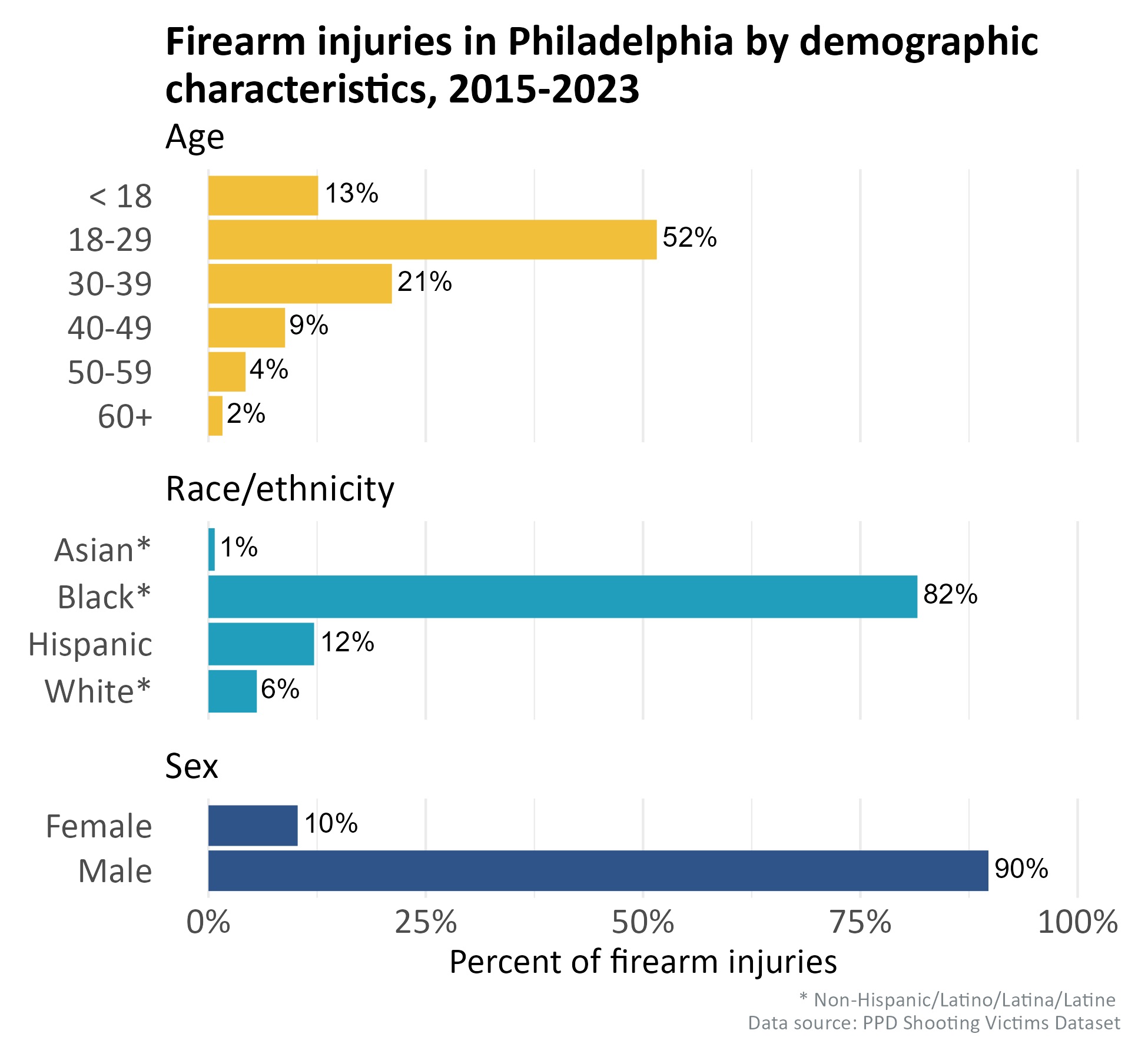
For reports depicting publicly-available demographic characteristics, I find it most efficient to combine multiple demographics plots (in this example, age, race/ethnicity, and sex) into multiple horizontal plots which all share an axis. I found that ggplot2 and patchwork can help format this combined plot.
In this example (R code embedded below), I import and clean the Philadelphia Police Department (PPD) Shooting Victims Dataset, which is available on OpenDataPhilly via API. I then summarize these data into multiple dataframes, plot them with ggplot2, and combine them into one plot with patchwork. I ensure that the plot aspect ratios, bar widths, labels, and more are consistent even with varying numbers of categories in each subplot.
The final combined horizontal bar plot is displayed at the bottom of this page. Each summarized dataframe by different demographic has its own subtitle and distinguished color for all bars. All subplots share the same x axis, which shows the percentage that each category within the demographic summary makes up among all shooting victims recorded in the dataset.